What can and can’t you do with Telraam data?
Data • Written by Kris Vanherle on 10 May 2023
If you’re the proud owner of a Telraam device, be it our original Raspberry Pi-based “V1” sensor, or our brand new purpose-built S2 sensor, you’ve probably wondered, “OK, I’ve got months and months of Telraam data for my street, now what?”
Risks and Rewards
In this blogpost I’ll try to provide some insight into what reasonable data analyses you can do with traffic counting data, in particular with the type of data your Telraam sensor is producing. As Telraam was “born” at Transport & Mobility Leuven, a group of traffic engineers specialised in the analysis of traffic data, we know the value Telraam data can bring, but also what the risks are if you “over interpret” or ignore the limitations of raw traffic counting data.
As with any technology, Telraam is not ‘perfect’, so Telraam data is not perfect either. We currently estimate accuracy of motorised traffic counts to be 90-95% (for S2) or 85-90% (for V1). For bikes/pedestrians accuracy is lower - even on suitable sites -, while the V1 sensor is more prone to misclassification. The new S2 sensor is more accurate for bikes/pedestrians (+/- 80-85%) with much lower risk of misclassification (e.g. having a group of bikes counted as a car).
What’s so particular about Telraam data is that the data is generated over a long period of time. Traffic counting data is usually limited in time, for example using pneumatic tubes or temporary camera systems (LIDAR, ANPR) over a period of only a couple of weeks, or more limited still, manual counting for just a few hours. The sheer volume of data you collect with a Telraam sensor is an asset in itself. You should make the most of that asset when looking at your data. I’ll show you how below, with 3 examples of what you can do with your Telraam data.
Example 1: Time series
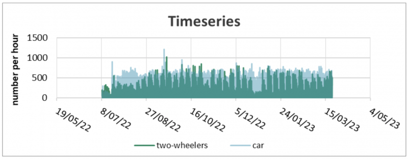
In a time series analysis, you’re plotting the volume of cars/bikes/pedestrians (Y-axis) versus time (X-axis). This is an easy graph to generate and understand. Still, it’s important to keep a few things in mind.
First of all, DO NOT plot this for daily totals with Telraam data. Take a moment to consider why that might be…
…
…
…
Hint: Telraam (currently and historically) only generates data when it’s light.
Here in Belgium there’s about 6 hours of daylight difference between winter and summer, so if you’re going to plot daily totals, you’ll see big seasonal differences which isn’t useful, or worse, could result in misleading information about trends in traffic. So, what’s better? You can plot hourly totals, circumventing the fact there are fewer hours with data in winter compared to summer, easy! Still, you have to be careful, because in (deep) winter, you may be missing data on those busiest peak hours. The safest approach is to only select those hours for which there’s data all year.
Now what can you learn from such a graph? From the example above, which is in fact the Telraam device active in Belgium’s Prime Minister’s office (I kid you not) on the Wetstraat, you can learn a few things “at a glance”. Car traffic has more or less been stable, with reduced volumes during the Christmas holiday. However, two-wheeler traffic picked up during August and later on. There’s also an interesting spike at the end of August/early September.
This type of graph is useful for:
- Seeing what timeframes are interesting to explore deeper
- Quick overview of “events” in the data: short or long periods of atypical high/low traffic volumes
- Identifying specific time intervals you want to focus your analysis on. You’ll want to ignore time periods with data gaps (e.g. sensor was temporarily offline) or periods you know are not representative for whatever reason.
Example 2: Typical volumes
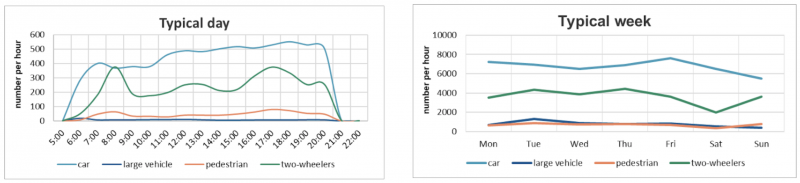
This is the type of analysis where Telraam data shines. Select a (long) interval, and determine the “typical” traffic pattern for this period. Here are 2 examples of a typical (working) day on the left and a typical week on the right. For the typical daily profile, take the median value (not the average, I’ll explain why later on) for every hour of a working day, for a period of 2 months. There are about 40 non-weekend days in 2 months, so you have 40 data points for every hour of the day. Traffic will fluctuate somewhat, but with 40 data points you’ve got enough data to determine what’s typical for each hour.
The median value is the middle value if you rank the data from small to large, so you automatically discard outliers and atypical traffic volumes in that period. Median is better than average because the latter can skew the typical value upwards (or downwards) if you’ve got one or more hours of crazily high (or low) traffic volumes.
The credo here is, the more data, the better. The longer time interval you choose to determine your typical volumes, the more stable and representative it is for your street. However, there’s no “golden standard” for this and you have to understand you’re hiding any fluctuations in the traffic patterns within the period you select. For example, if you pick a period of May 1st to August 1st to derive a typical pattern, you’re working with 3 months worth of data (good), but you’re also mixing up a month of school summer holiday (July) with 2 “regular” months (May & June). Would you call the resulting traffic pattern really “typical”?...
In traffic engineering, the most “normal” months to determine typical traffic usually are March/April/May/June and September/October/November. December/January/July/August are not typical because of holidays. To determine what period is representative will be highly dependent on the context. For example, construction works can influence traffic a lot and you don’t want to select a period where something happened that influences the typical traffic patterns…
… or, maybe that’s exactly what you want to do? In some cases, indeed, that’s exactly what you want to do, so let’s go ahead and do it!
Example 3: Comparing periods
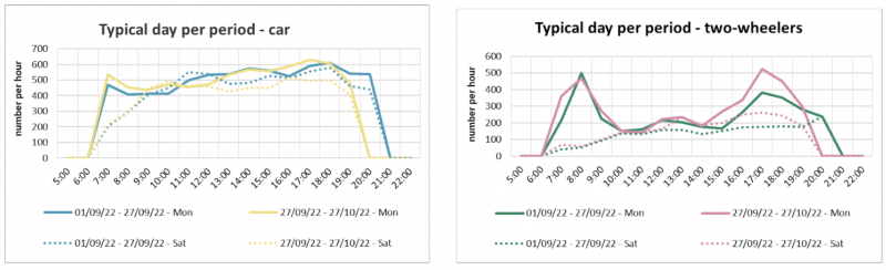
So, building further on typical profiles – either a typical day (with traffic volume per hour) or typical week (with traffic volume per day), you can also compare the typical traffic for different periods. This type of analysis is extremely useful if you want to understand if a - planned or unplanned - intervention or event is causing a systematic change to the traffic volume.
Purposeful action, such as introducing a new bike lane or access restriction, specifically aims to achieve systematic change in the traffic patterns. If you want to know if that intervention is effective, systematically, you need to measure for a long time to see if typical traffic patterns are (systematically) different in the period before vs. the period after the intervention.
The same “rules” apply here as in the previous example. You need to have a representative period. Note that you don’t necessarily need exactly the same period for comparison; you can take 3 months of data to determine your “baseline” typical traffic pattern and compare it with 1 month of data to determine typical traffic pattern post intervention. The latter is just a bit more uncertain to indeed be labelled as “typical”. Also, in some cases, it takes time for traffic patterns to adjust to a new situation, so you want a time period which is long enough post intervention to make any statements if there’s a new typical traffic pattern. Choosing the right time intervals is not an exact science…
Now, once you’ve got 2 periods with typical traffic, the question is, how to recognise a significant change to the traffic pattern?
In the introduction we noted that Telraam’s accuracy is not 100%. So, you may be wondering if you can make any claims at all if typical traffic volumes differ, say 10%, before/after an intervention, for a device that has 85-90% accuracy? The volume of data Telraam is the key asset here. First, any incidental counting error, for whatever reason, is not an issue when you work with typical traffic patterns. Typical traffic is stable, not affected by incidental errors, but could still be prone to systematic errors. However, because the systematic error is the same before and after the intervention, both typical patterns are still very much comparable!
That being said, there will always be _some_ variation in traffic volumes, so it’s still hard to claim if traffic patterns have systematically changed. How much change would indicate a significant, systematic change?
In the example above, we’re plotting typical car traffic (left figure) and two-wheelers (right figure) for 2 periods, for a typical Monday (full line) and a typical Saturday (dashed line). Obviously, the patterns are not _exactly_ the same, but they more or less are. Indications of a statistically significant difference between the 2 periods would be true if the shape of the pattern were the same for both periods, while volumes for every hour are higher/lower in one period compared to the other. In this example, we can’t really see any difference between the 2 periods, EXCEPT, for two-wheeler traffic in the afternoon. There’s a clear offset of about 100/h between 15.00-18.00. Another indication is that this observation holds both for Mondays (full line) and Saturdays (dashed line), providing another clue something is definitely going on here. From this comparison, one could argue that two-wheeler traffic has gone up systematically from (in this case) 27th of September.
CONCLUSION
The message of this blogpost is to encourage you to go ahead and let your data tell a story, but to maintain a healthy degree of caution when interpreting that data.
You’ll have to be alert to the context behind the phenomena you’re observing in the data. That context matters. Is what you think you’re seeing really there? For example, could an increase in bike traffic be because there’s a new bike lane… or because the weather has been much better lately?
Data has its limitations, that’s why I prefer the term “data-informed” over the more commonly used term “data-driven”. Don’t let that data drive you astray!
There will be errors. It doesn’t help anyone to pretend there aren’t any. At Telraam we choose not to hide or mask any sensor errors, and present you with the raw data. We also make the data ‘open’ so anyone can also add their own interpretation.
Data interpretation is important, and that is why we believe there is great potential in a citizen science approach to traffic data gathering. Not only are citizens motivated to gather and review the data, but they can also provide local knowledge and experience in order to add the all-important context.
I hope this blogpost helps to provide some insights into what you can do to start with your Telraam data.
There is always more you can do, so please share your stories, experiences and questions with the Telraam community so we can build a more equitable and informed picture, with data, together.
(These figures were created using the Telraam “street sheet”. This functionality is an automated analysis available for Telraam devices which are part of a project, in a professional network. We plan to unlock these features in the near future for single users as well. You can generate all these graphs either from the detail page per segment, or download and process your data in Excel)