New style, admin and more!
releases • Written by Dave Driesmans on 24 March 2022

At the time, we based our first logo on the spheres in a classic abacus. In the first years, this logo gave us a lot of visibility and recognition. But with a new sensor in sight, we thought it would be good to upgrade the logo without radically changing it. A process that the biggest brands like Google, Volkswagen etc. regularly go through when it comes to optimising their logo.
So it is with us as well.
The new logo includes (of course) the text 'Telraam' combined with an icon. This icon is an abstract representation of our open character. You can recognise the balls of an abacus in it, or two people talking or even four people, two of whom are holding hands. It symbolises the counting of data, the sharing and exchange of information and the bond that Telraam establishes with citizens.
We consider it a successful transformation and are pleased that we were assisted in this process by graphic designer Broos Stoffels. He immediately sensed what we were looking for in this new visual identity.
Does that mean that the cat will disappear?
No, it does not! One of the starting points for Broos’ assignment was the fact that we would like to keep Lien Geeroms' illustrations in our means of communication. After all, they perfectly visualise what we want to achieve with Telraam and who and what is involved. So the cat is here to stay!
Website & dashboard upgrade
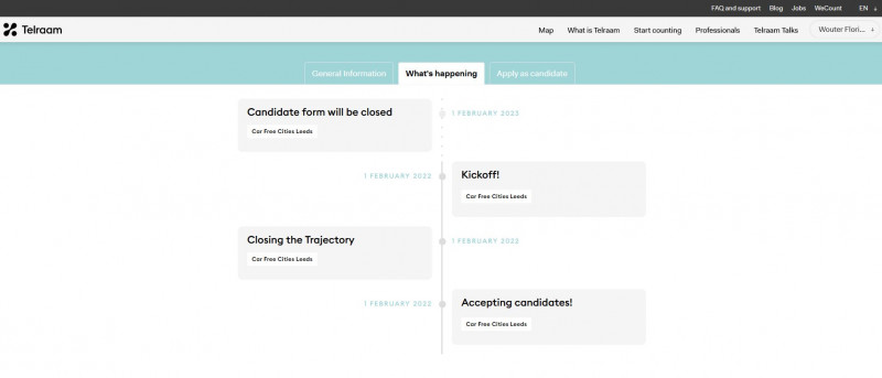
Together with the new logo, Broos also developed a brand guide for Telraam: a new font, design elements that we are integrating into the website and presentations. And you can't miss it, we have meanwhile incorporated it in a number of changes on the website. The underlying dashboard has also been thoroughly optimised and has, for example, been given new functionality whereby we can display a timeline for projects and visualise a division into different trajectories.
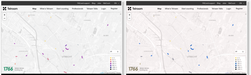
Inclusive colours
Did you know that 1 out of 10 (mainly) men suffers from colour blindness? If you are colour blind you either do not see red, green or blue shades of colour. And combinations of red and green, blue and yellow, green and brown are completely out of the question.
From now on, we will take this into account on the updated website. We have adjusted the colour palette of the traffic intensities so that they can also be seen and read by people with colour blindness. By the way, you can do the test for your own website on this site.
Open source & ethical tools
Finally, we would like to mention that we have ended our collaboration with Mailchimp and Google Analytics and have started using Mailcoach and Plausible for the same functionalities.
With these alternative tools, we are more in line with the norms and values of our business: open source, more sustainable, less complex, more ethical and less energy-consuming.
By the way, Plausible is a tip from a Telraam-counter that has pointed out the pitfalls of Google Analytics, thanks again!
In this overview you can find the changes chronologically.